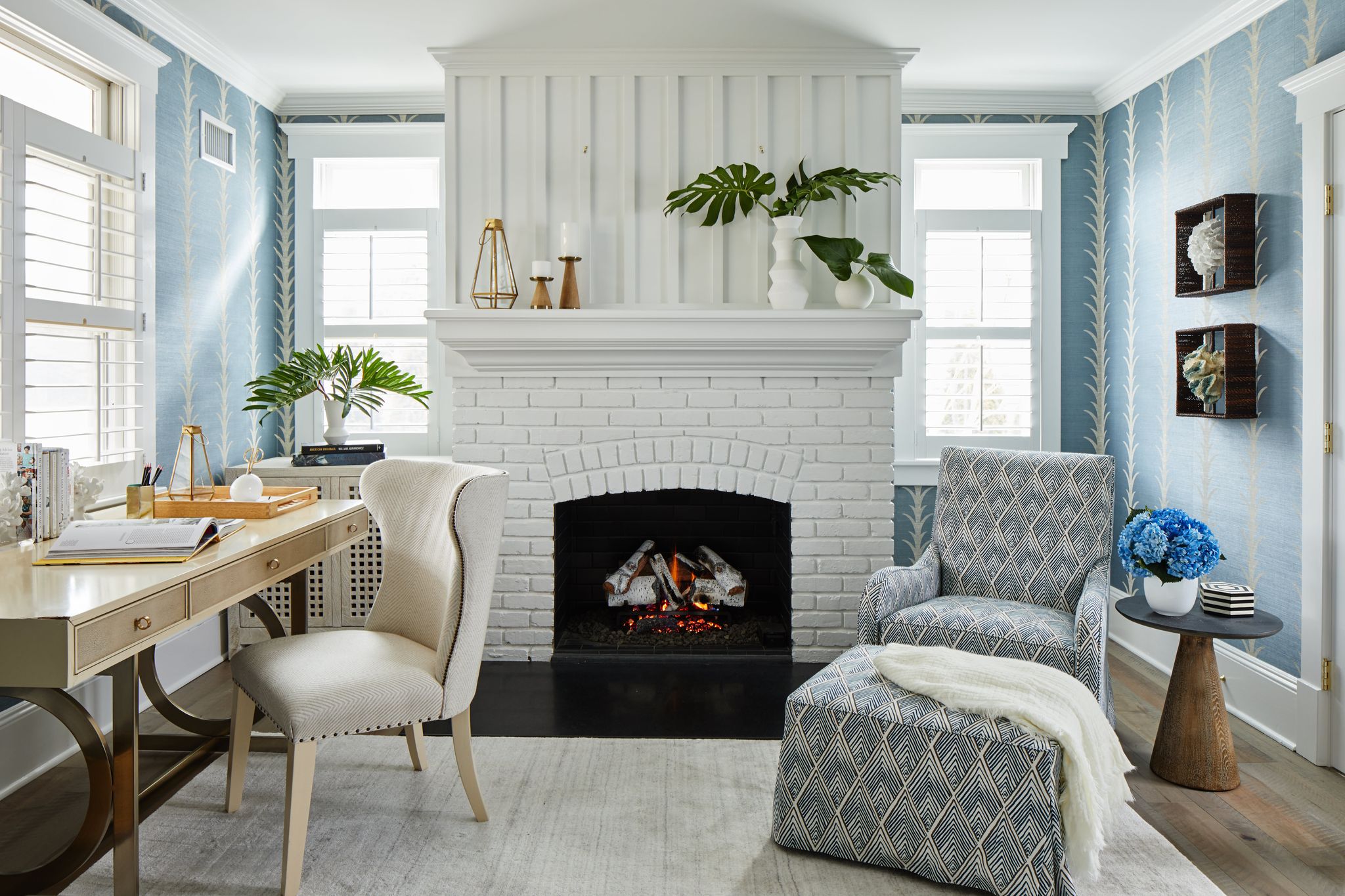
If you follow us on Instagram or browse our site, you'll notice that one of our favorite colors for home interiors is blue. In the shop, we offer blue and white chinoiserie, blue chandeliers, blue decor (heck, even our site color palette has blue). Our love for blue interior design is not an accident. Blue is a color we always encourage designers to include when they're creating a space. The reasoning? It goes way beyond "currently trending" and actually dives deep into the science and psychology behind design and color play.


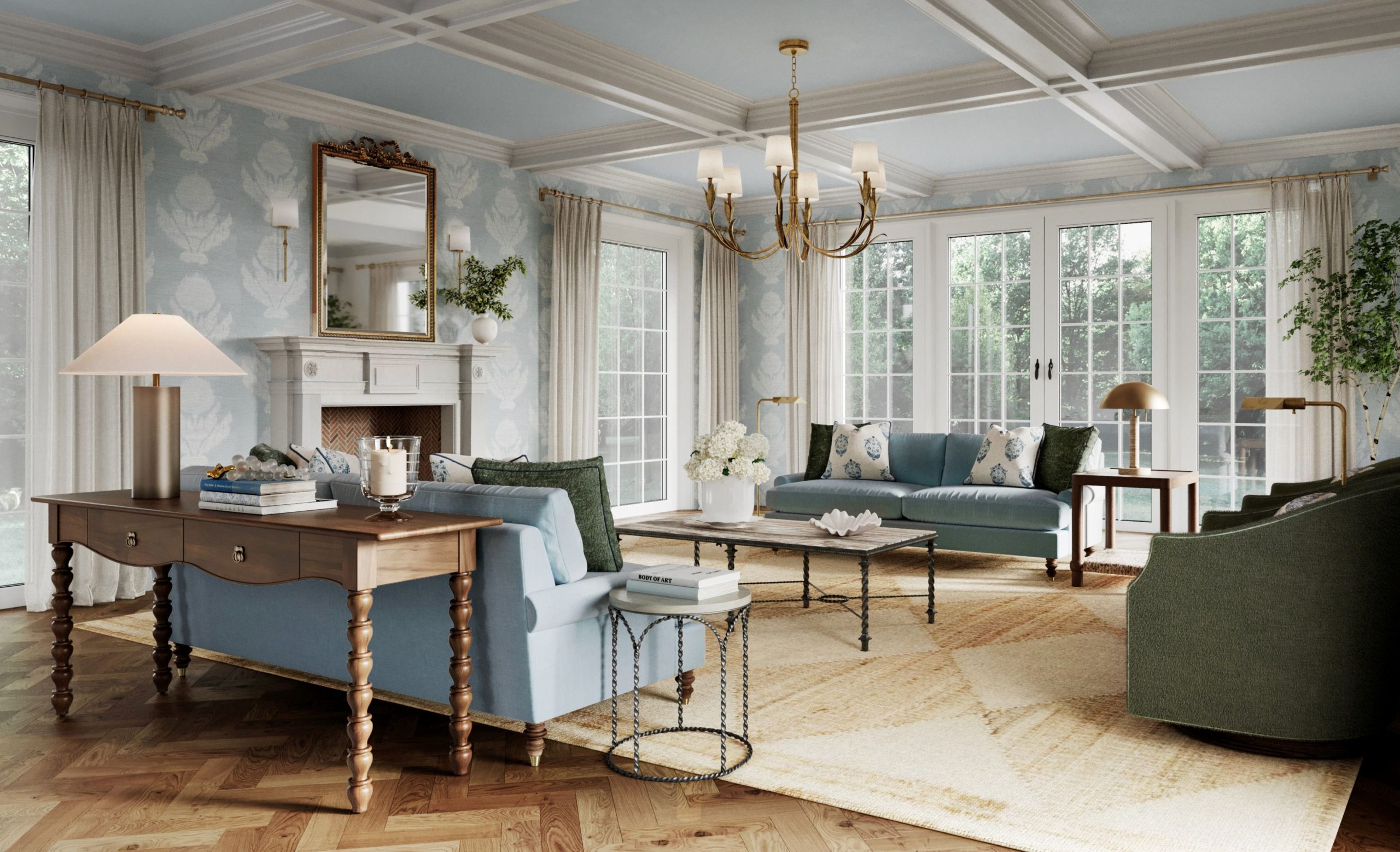
Here are our top 5 reasons why blue interior design is a beloved look!
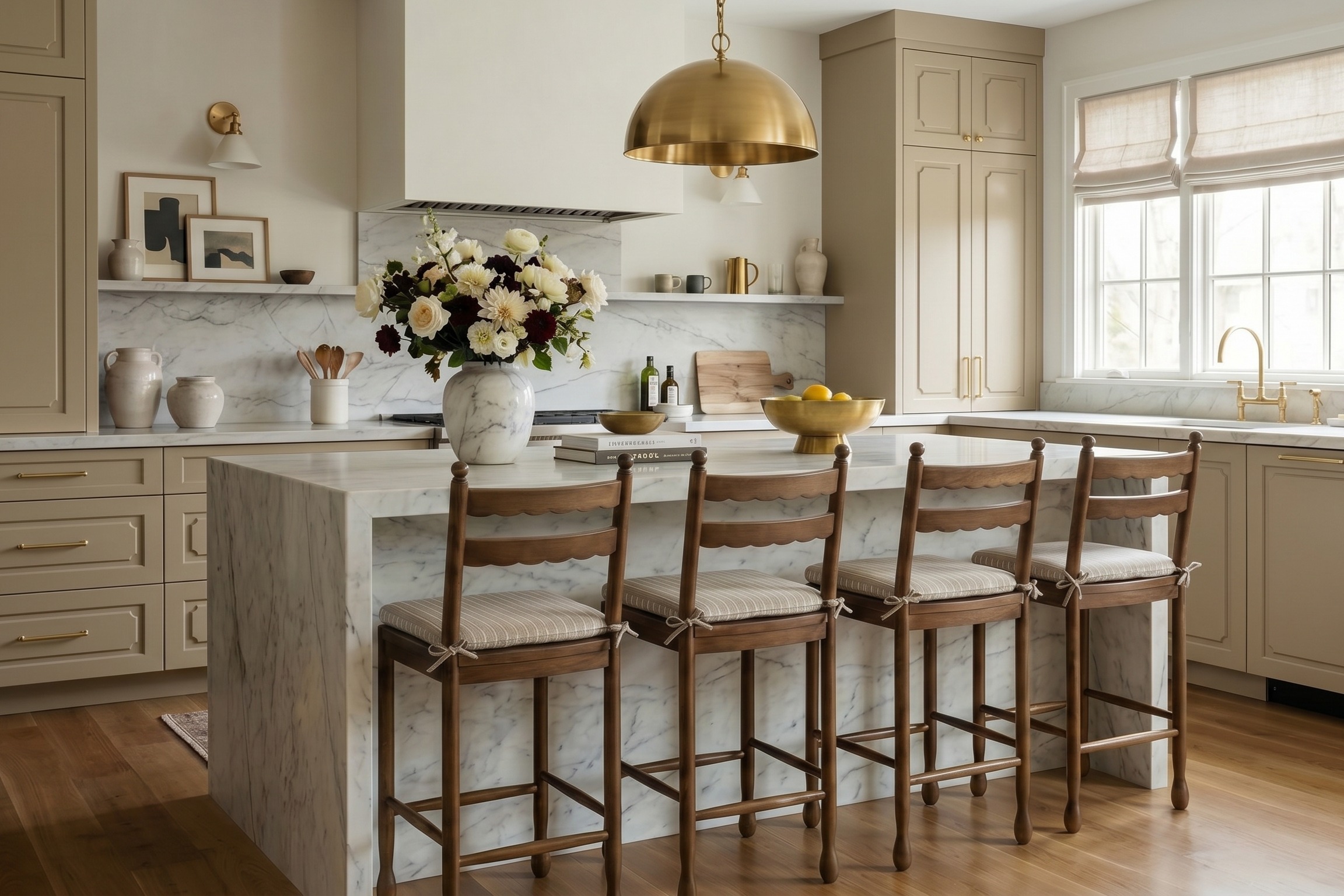
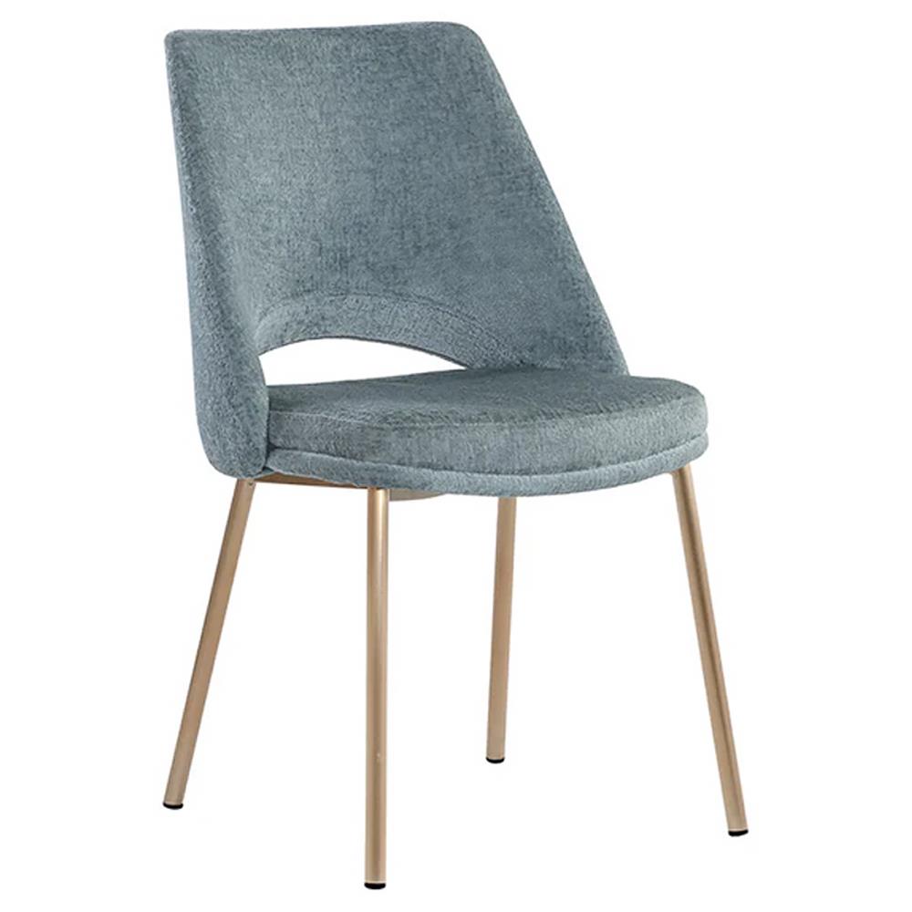
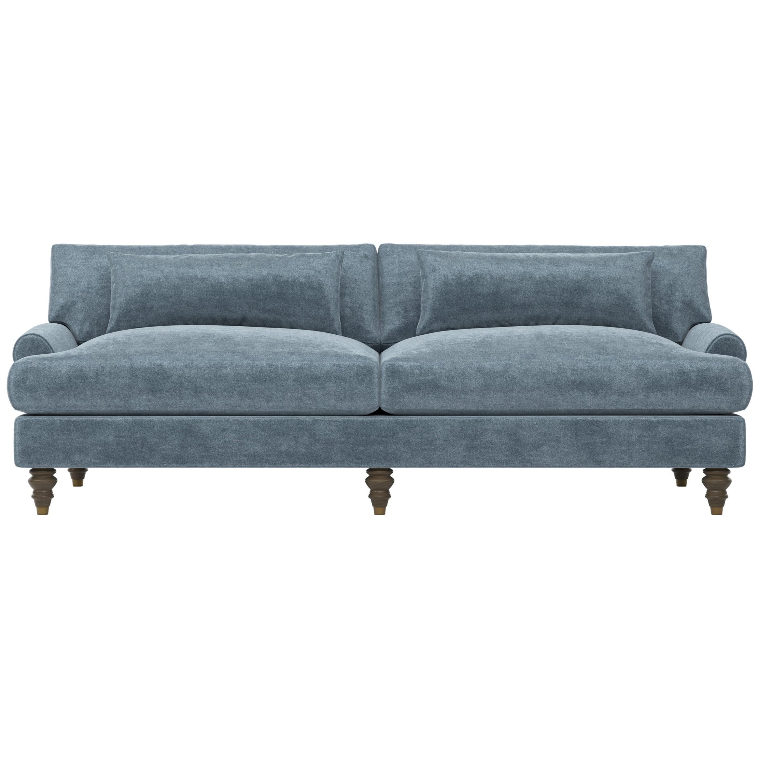
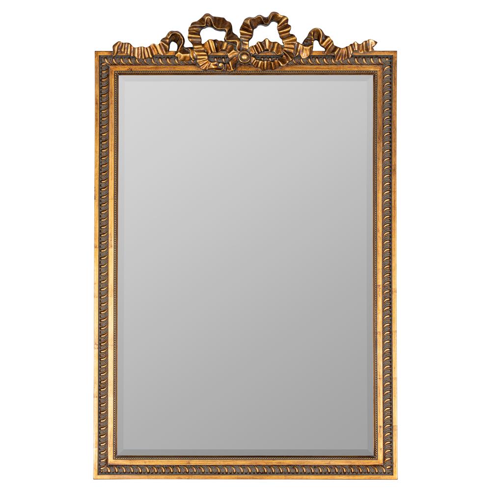
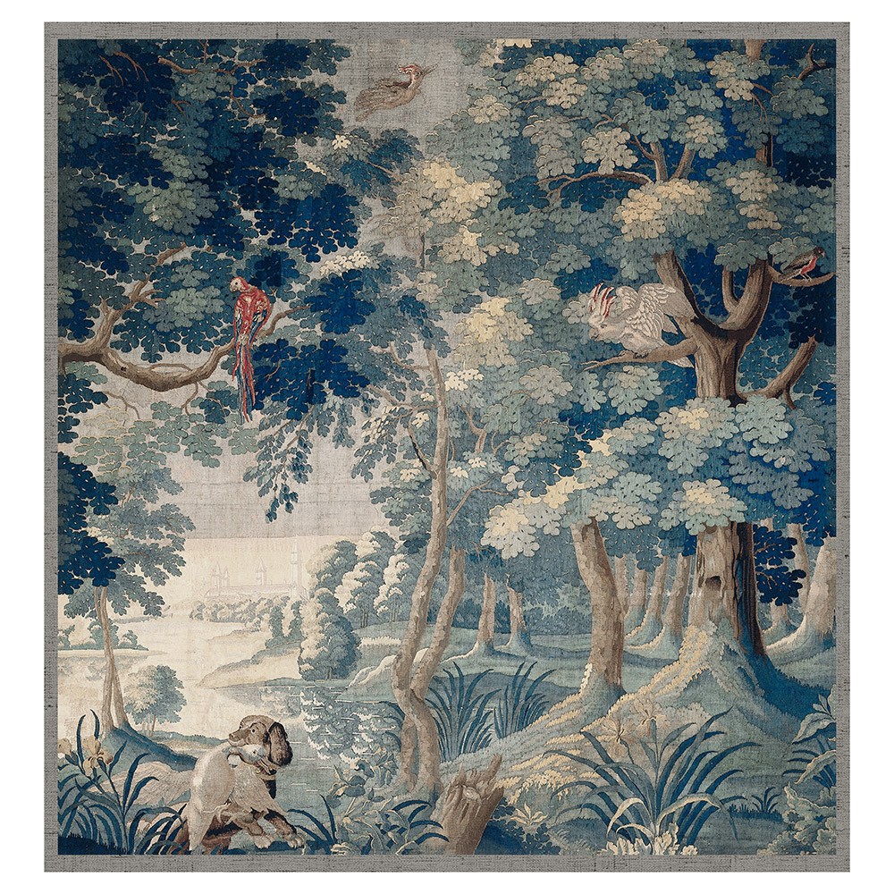
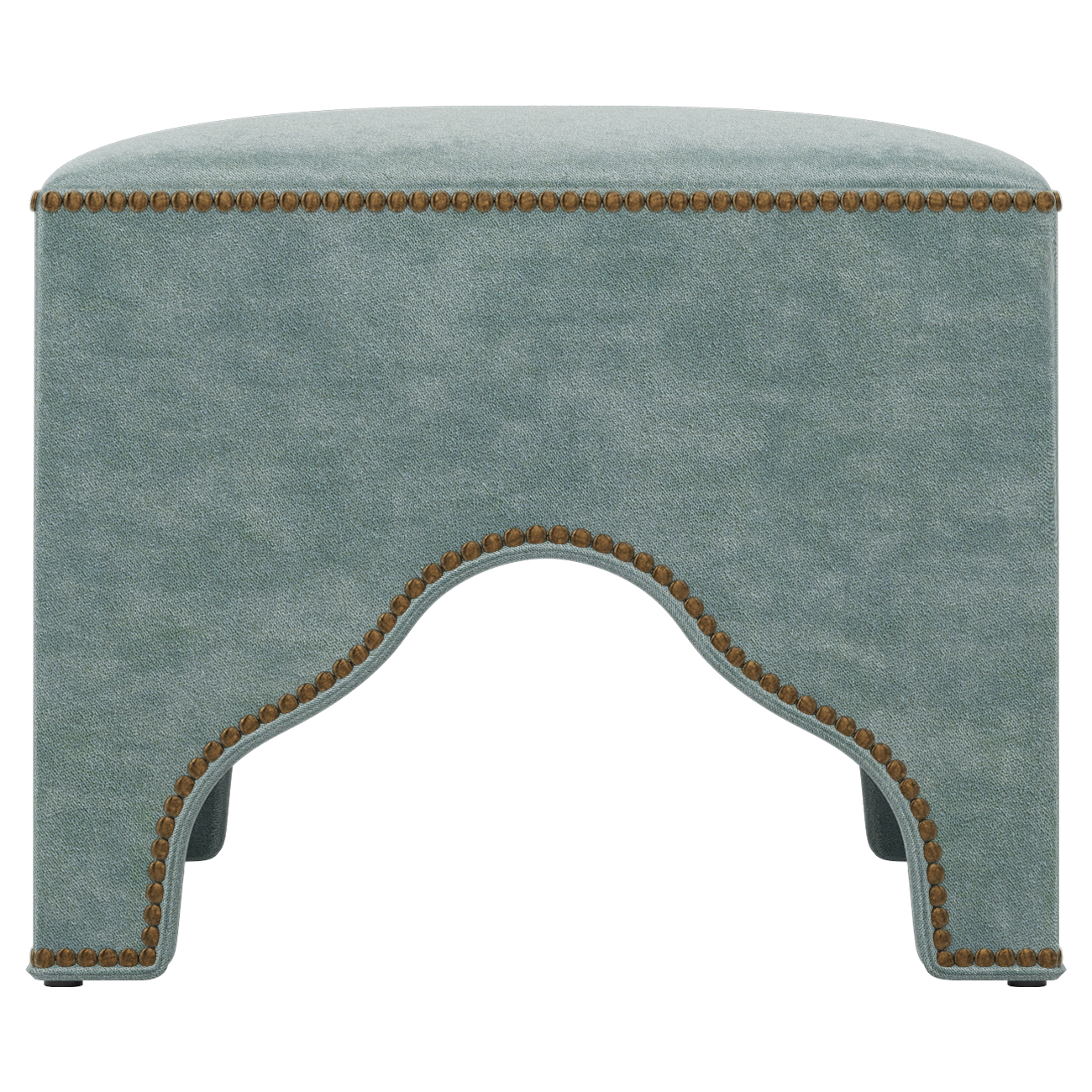
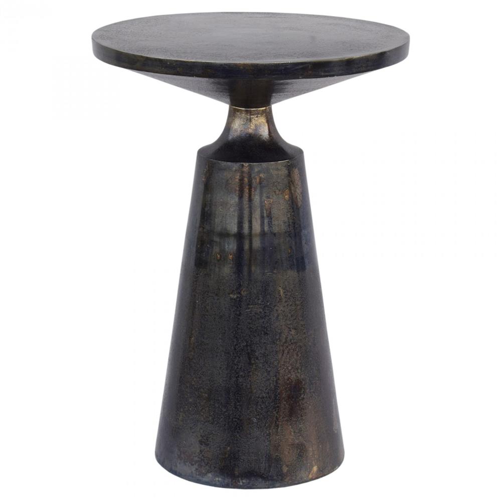
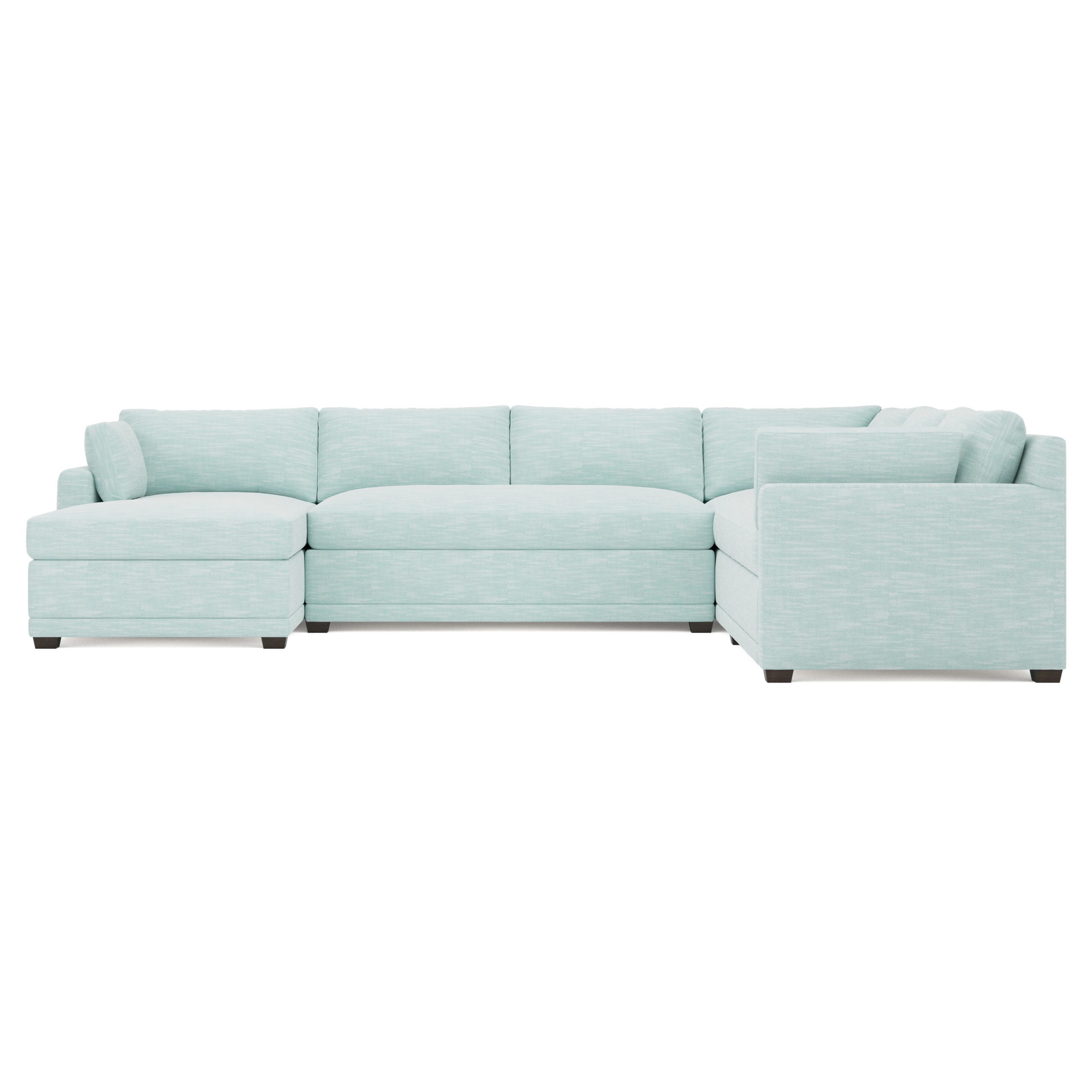
Shop the Look
1. Blue Light Goes the Farthest
Our first reason requires a little bit of science. When light shines on a piece of furniture or home decor, the item absorbs every color of the spectrum except one, which is the color you see. Because blue has a very short wavelength, it evades absorption and is therefore the easiest color to see (this is why the ocean usually appears blue, or why it can be tricky to tell if something is black or navy). Parse through the science, and you get this: Blue is a great color for interiors, especially in dark spaces, because it injects a space with lightness and color! If there's a lot of natural light, blue will make a room gleam. And even if there aren't many windows, blue will naturally draw light and color out of a dark room.
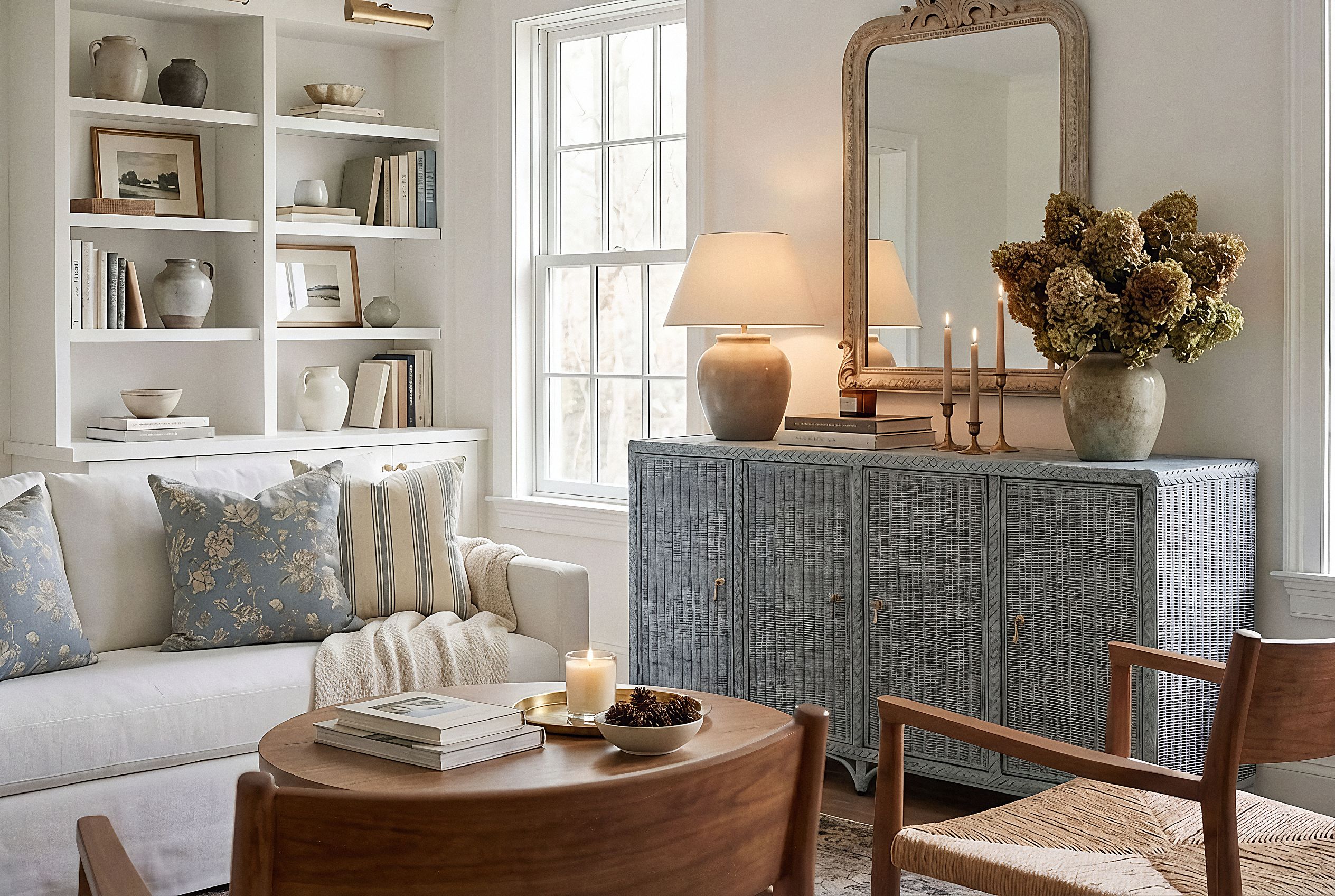
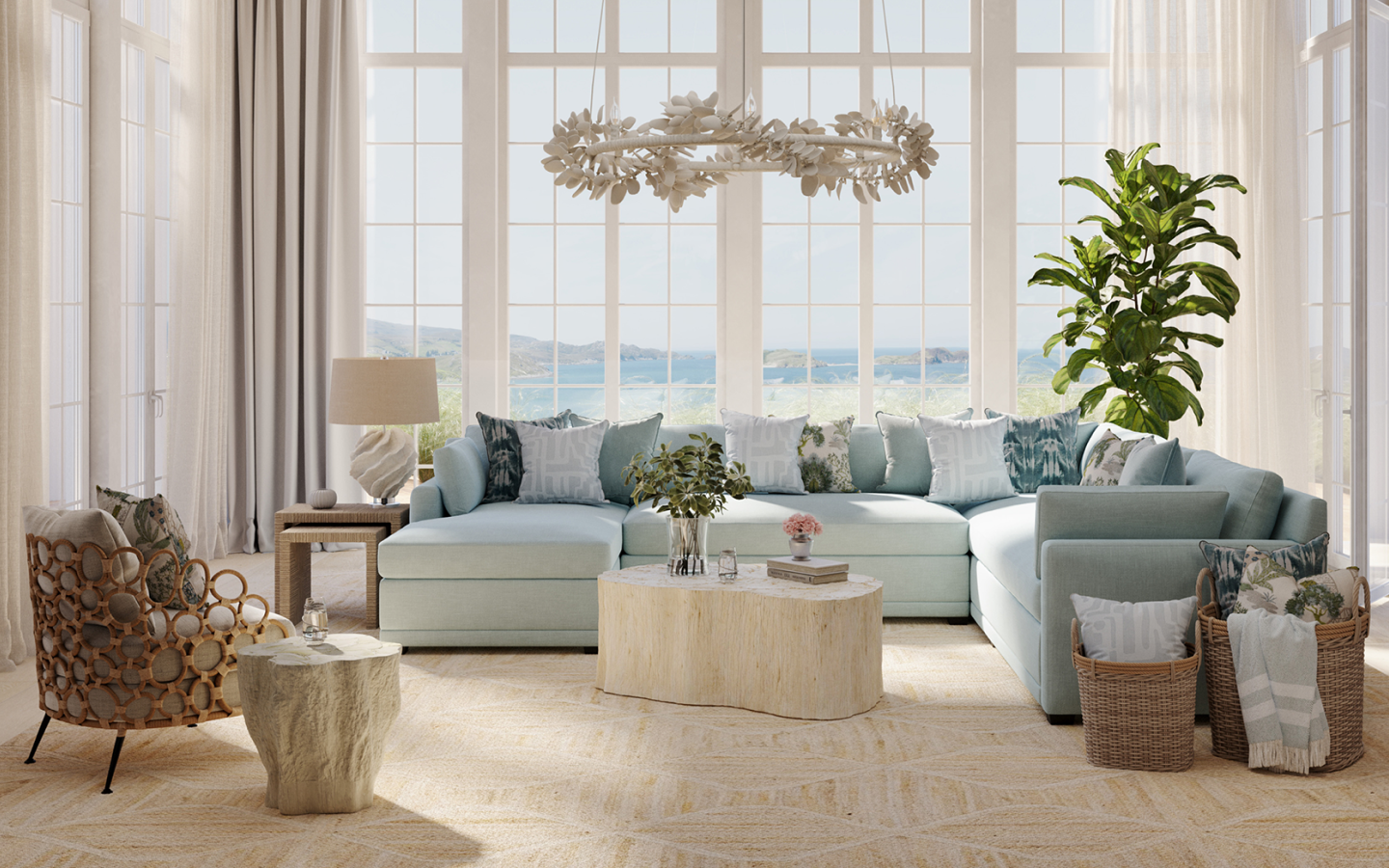
Shop the Look
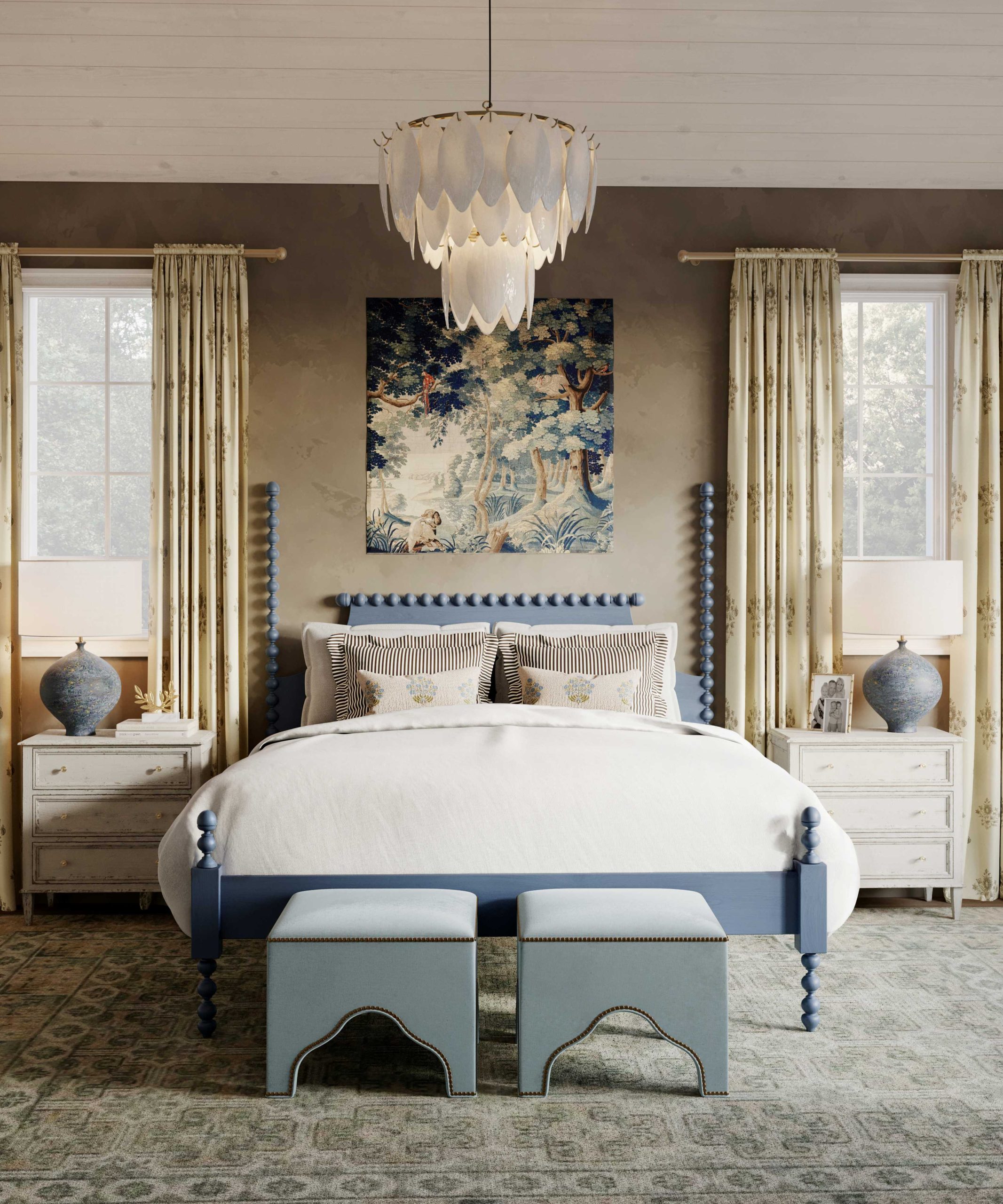
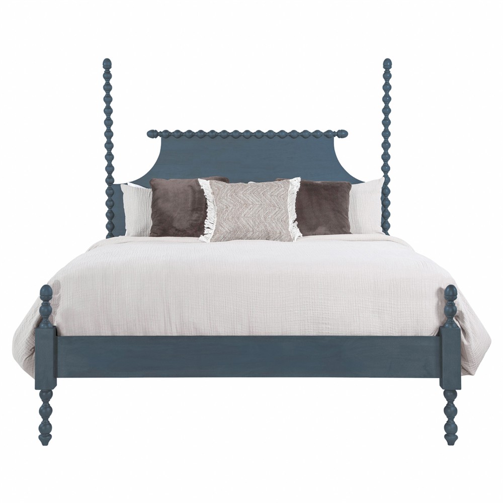
2. Blue Interior Design Is Good for Your Health
Don't believe us? Blue rooms have actually been shown to lower blood pressure and heart rate, and although it opposes the "feeling blue" idiom, living in a blue room has been proven in multiple studies to help people with depression. It's almost impossible to be stressed out in a blue room! Blue helps us sleep too.
The color neutralizes melatonin levels (a hormone that anticipates the onset of nighttime) meaning that it's a refreshing and energizing color when our melatonin is low in the morning, and it's a soothing and relaxing color at night when our melatonin is high and we're trying to fall asleep. What does this all mean for interior designers? No question about it: blue is the color for the bedroom.
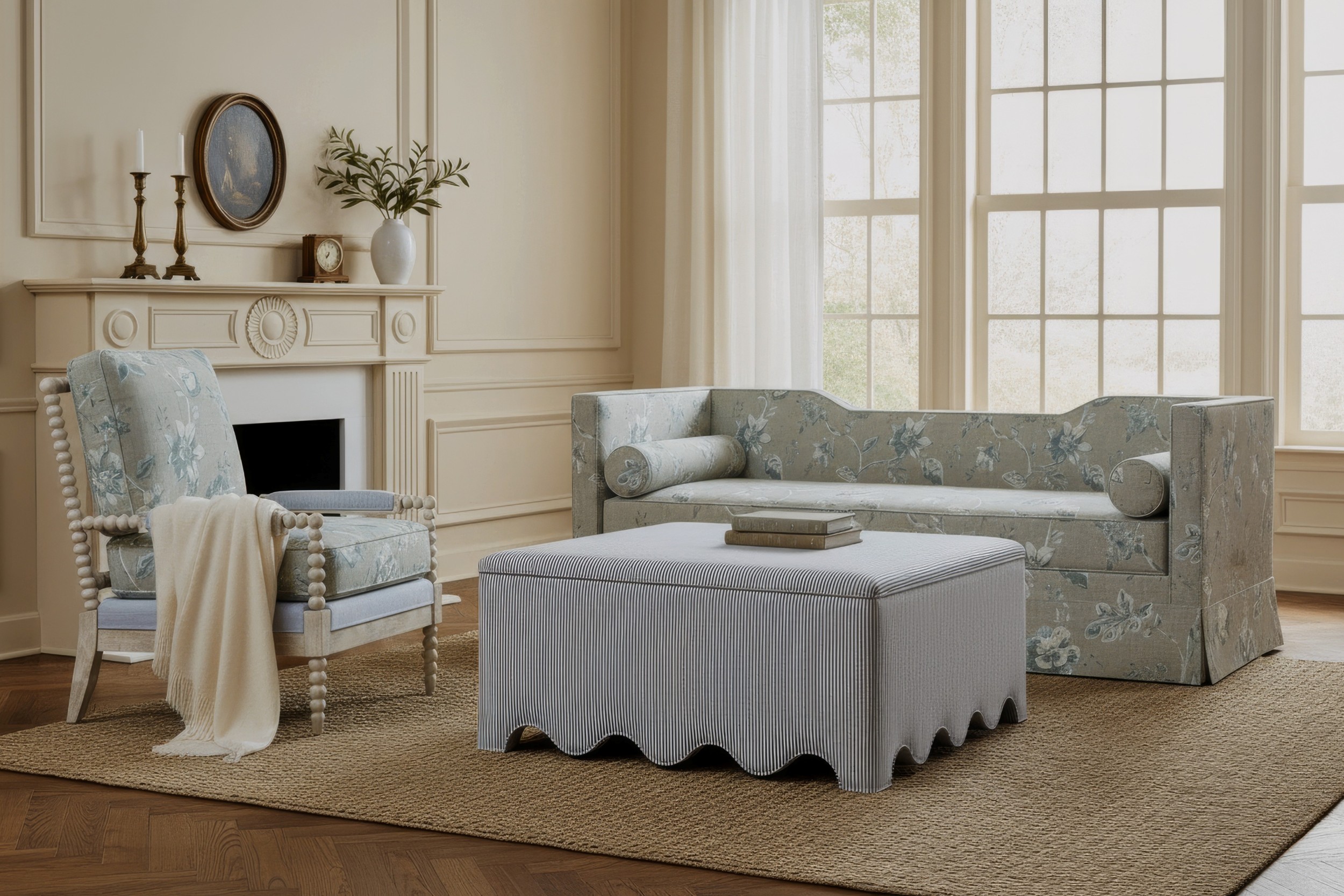
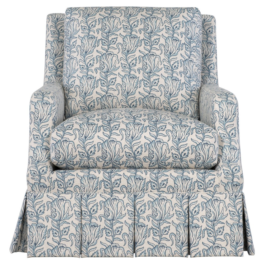
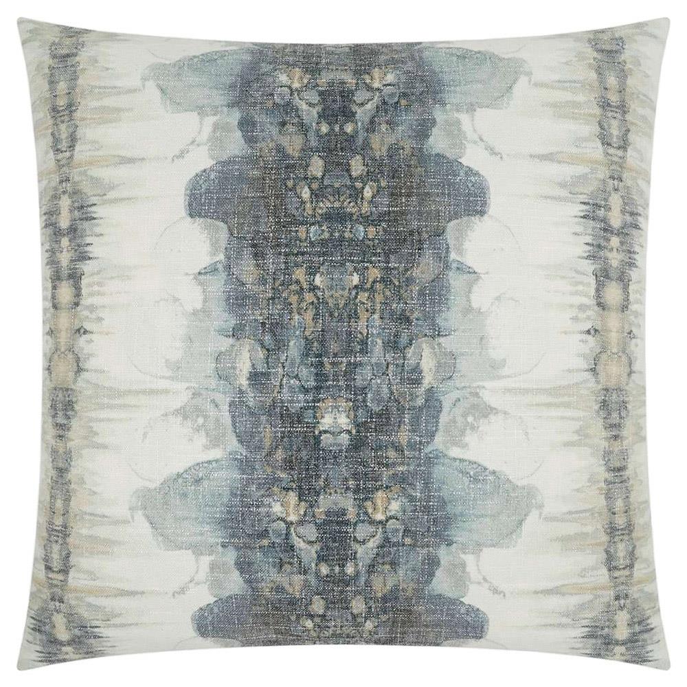
Shop the Look
3. Blue Offers the Most Versatile Palette
Every color has an anthology of shades and hues, but it's going to be tricky to find a soothing red or a bright and fun grey. Blue, however, is a color without limits. Add pale blue into your space to soften a corner, choose a dramatic blue for a strong regal flare, toss in a bright blue for an electric pop of color, or stick with a neutral shade for an inviting color to paint the walls. Blue is also preferable because it works as a complement to almost any color on the wheel. We love blue and white together, but blue also pairs excellently with bright colors that are sometimes difficult to work with (like green, orange, or fuchsia) and with several materials, like wood and metallics.
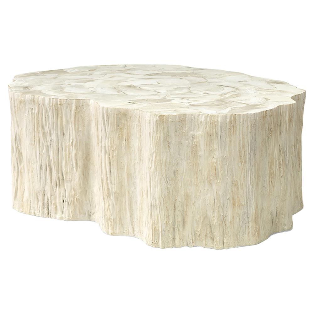
Shop the Look
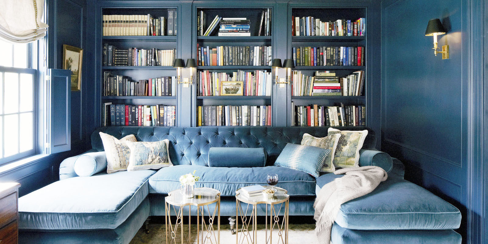
4. Blue Won't Overwhelm Your Design
You can use multiple shades of azure or navy in the same room and achieve a look that's both stunning and approachable. Because blue has such a versatile palette, as mentioned above, you can put colored furniture and decor in a blue room using similar hued fabrics, and your eyes won't feel too overwhelmed! (That said, we always encourage incorporating neutrals into a room for the best visual balance).
Shop the Look
5. Blue Is Already Your Favorite Color
Is this true for you? Because it's true for about 45% of males and 35% of females, making blue the most popular favorite color for both genders. This is great knowledge to have as a designer. If you're working on a commercial project that has to be universally appealing, or if you just have a tricky client who isn't loving your color choices...try blue interior design. The odds are in your favor.
Shop the Look
So many shades of blue you don't know what to do?
No problem. Here are some common shades and some of our favorite design uses:| Grey-Blue | Use for creating a spa-like atmosphere in the bath, cool cabinetry in the kitchen, or for serene bedroom walls. |
| Royal Blue | Our go-to choice to pair with regency furniture. It's also the shade typically used in traditional blue and white palettes. |
| Sky Blue | Great for coastal beach style bathrooms, cabana-style chairs, vintage-style kitchen islands, or beach-y slipcovers. |
| Robin-Egg Blue | This hue is a lot of fun as a modern wallpaper color or the color choice for a bold bathroom tile. |
| Steel Blue | Enjoy steel blue's luxe tones for a French glamour look. It also serves as a recommended backdrop color when mixing patterns. |
| Caribbean Blue | This bright blue is playful and perfect for a kids room (or use it as a bright pop of color for an accessory item). |
| Aqua | This is the perfect color for a feminine or beach-y kitchen, a tween girl's bedroom, or for fun accessories. |
| Turquoise | Great for colorful kids rooms or for a hip midcentury look. |
| Navy | It's the go-to for nautical designs, but we also like it for bold built-ins. |
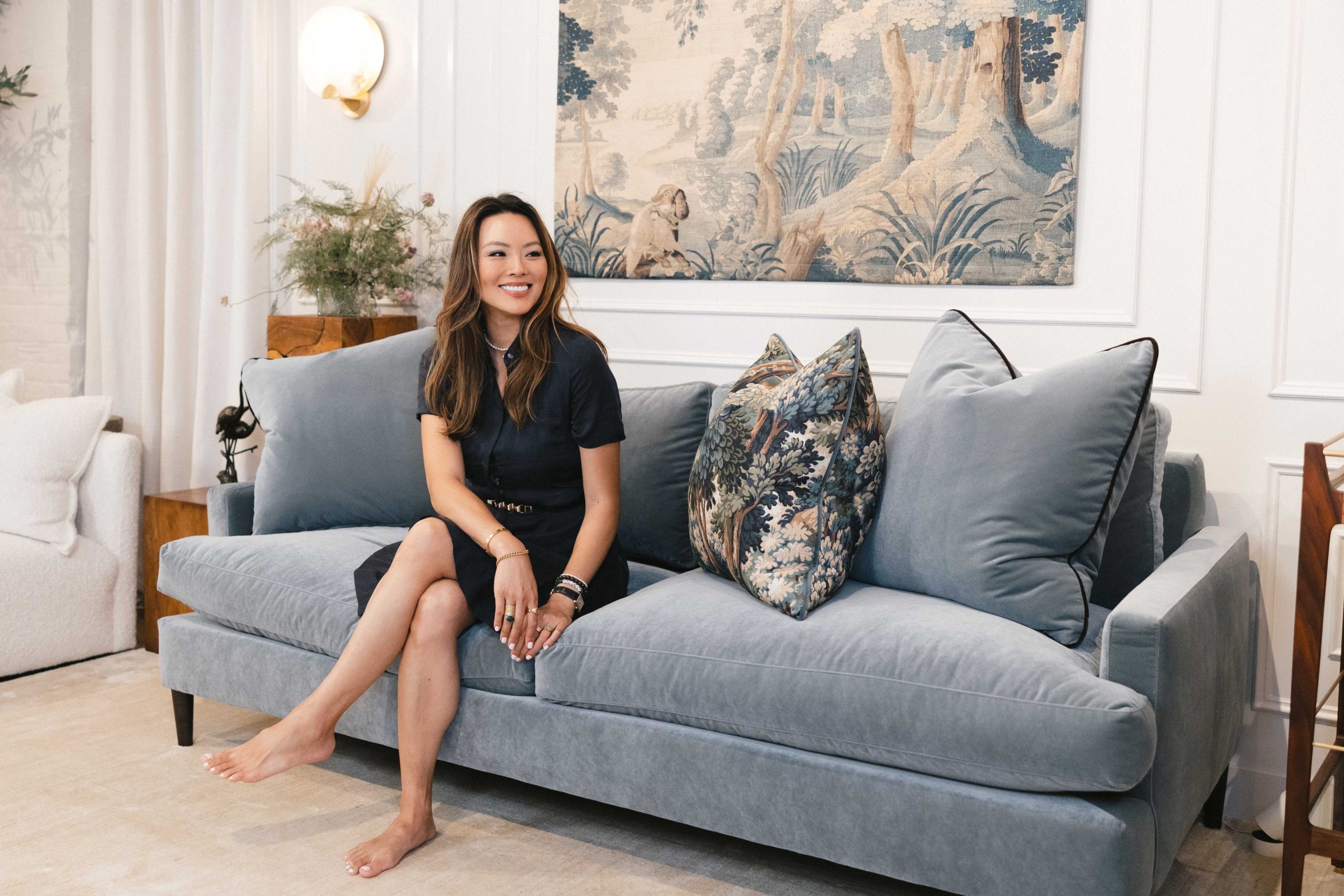
Kathy Kuo Studio
Need design help? Kathy Kuo Studio is a full-service design firm working with clients in the United States and abroad. From warm, timeless interiors to serene outdoor retreats, our talented team of accredited designers creates spaces that feel like home, designed around how you live and what you love.
Schedule a free consultation, call (888) 908-3486, or email studio@kathykuohome.com today to get started!